Last Updated: 02/19/2024
ISI For Pharma & Healthcare Websites
One of the main talking points when kicking off website design within the pharmaceutical and med-tech industry is always how to strategically display the ISI or important safety information, in the most non-intrusive way.
When you hear words, important safety information, what do you think of? Side effects, risk factors, and possible dangers associated with a product, drug, or treatment. While it is required to provide this information within certain parameters, it is also important that it does not take away from the overall user experience on the website, become a visual focal point, or decrease marketing efforts.
A common challenge for medical brands is combining best practices in design and marketing their brand effectively while also satisfying legal requirements. FDA guidance is vague at best. They want medical websites to have an equal balance of marketing claims and indication statements on the intended use as well as clearly identified side effects and risks. But what that equal balance actually looks like is left up to the individual companies to decide.
With our vast experience creating websites in the healthcare space, we have seen it all.
Through research, data, and experience we have come up with decisive best practices on how to best display the ISI while designing a pharmaceutical website. It is important to make it visually appealing and user-friendly while adhering to the FDA guidelines for the display of Important Safety Information.
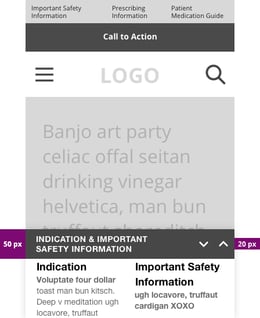
VISUAL GALLERY OF IMPORTANT SAFETY INFORMATION DISPLAY OPTIONS ALONG WITH OUR USER EXPERIENCE BEST PRACTICES FOR ISI TRAYS.
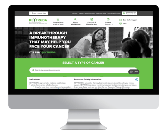
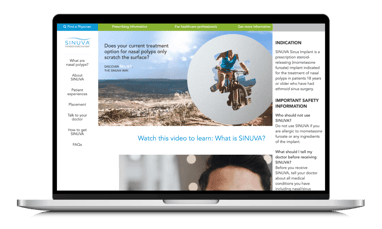
Most Pharma companies implement Important Safety Information (ISI) with the same standards: 33% tall tray on desktop or mobile browsers, with a 50 / 50 split between Important Safety & Indication Information.
Equally ubiquitous is an ISI tray where the Indication
content is in line with ISI content or missing from the tray altogether. The feasibility of this is determined by a medical device / pharmaceutical drug company’s legal board.
A lesser-known version of the Important Safety Information/Indication is a combo we like to call a tray sandwich, a clickable pop-up on the bottom of the screen.
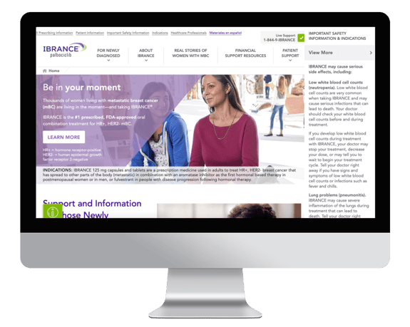
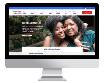
Another uncommon placement is the Indication information in a site’s hero artwork as seen by Ibrance’s right rail ISI + Hero Indication statement combo.
A Right Rail Indication + ISI can be a fresh look compared to the standard bottom tray implementation.
However, these side trays have proven to be a usability nightmare. Data has shown user frustration when it comes to page scroll functionality on websites with a scrollable sidebar tray placed near a browser’s native scrolling features. Pay close attention to page scroll controls vs. ISI tray scroll control interactivity to decrease user pain points.
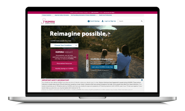
Depending on blackbox warnings & other legal considerations, sometimes a highly prominent Boxed Warning message is a part of your ISI / Indication tray.
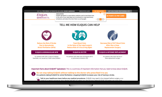
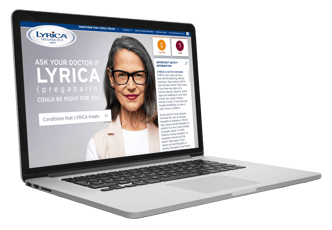
Some brands have explored making their ISI language native to the page + a separate Indication drop-down window as seen on Eliquis:
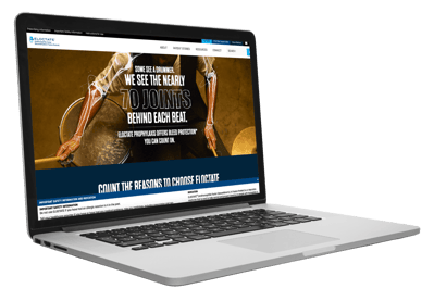
Horizontal Important Safety Information Anchor Link Callout Bar
One of the least-invasive Important Safety Information / Indication layouts we’ve seen is the horizontal ISI anchor link callout bar that drives a user down to the native ISI content already on the page. Eloctate’s small Important Safety Information and Indication blue bar at the bottom page will anchor link & auto-scroll you down to the page’s native content.
Which Scenario Is Best For Your Brand?
In most instances, the prominence and “fair balance” of a company’s Important Safety & Indication Information is determined by a company’s legal team.
“The law requires that product claim ads give a ‘fair balance’ of information about drug risks as compared with information about drug benefits. This means that the content and presentation of a drug’s most important risks must be reasonably similar to the content and presentation of its benefits.” (FDA source link)
See the Full FDA Guidance for Industry Presenting Risk Information in Prescription Drug and Medical Device Promotion for more information.
For ISI trays, this means that the amount of pixel space & screen real-estate that Important Safety Information & Indication Information requires is determined by legal boards outside the realm of marketers. So, unfortunately, medical marketers don’t have free reign over ISI layouts. It can be difficult to give a straight answer of which layout is best, as each medical product’s legal requirements are different. But, what we can showcase are some healthcare industry best practices for pharma ISI & Indication Trays that we’ve developed over the years.
UX Considerations For Important Safety Information (ISI) Tray Best Practices
Bottom ISI Tray leaves the most prominent page real estate for campaign messaging & overall navigation structure.
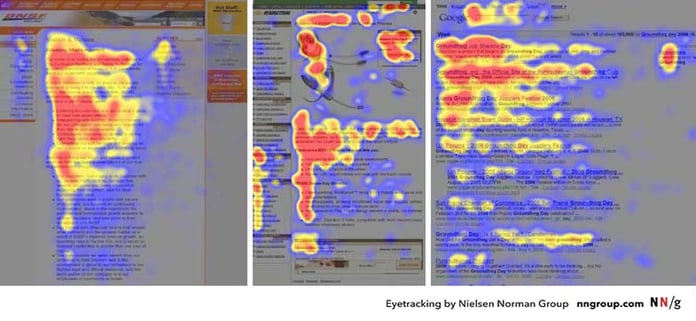
Usually, marketers aim to feature campaign artwork & a clear navigation structure in their above-the-fold (first full viewable screen) priority content. We know from years of industry research that web users typically eye-track in an F-shaped viewing pattern. If allowed by a product’s legal teams, we recommend sticking with the default bottom ISI tray so that other important content can be a user’s first visual priority. View the F Shaped image below from Nielsen Norman Group:
Utilize large click/tap states to collapse or expand your Important Safety Information tray, if legally permitted to collapse any Indication or Important Safety information.
If legally permitted to collapse any Indication or Important Safety information. This is especially important on mobile screens where website real estate is even tighter. We’ve seen an average of 2x more tray-collapse actions taken on mobile websites – the size of tap-state is even more important for a mobile experience.
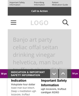
The W3C Web Accessibility Initiative has found that a mobile button size must be at least 44 x 44 pixels to meet accessibility minimum requirements – note the pixel height for the up/down arrows in the ISI tray examples below. The first example could easily lead to users tapping the wrong arrow or missing the ISI tray’s arrows altogether – creating user frustration & taking attention away from the site’s primary content and conversion goals.
Avoid overwhelming users with too many pop-ups & collapsible trays on page load
Between Entry Interstitial pop-ups on HCP websites, commonplace COVID-19 pop-up statements, required Utility Navigation links + a site’s menu structure and campaign messaging… Your users may experience cognitive overload from too many different transactional messages appearing, discouraging them from diving deeper into your website’s content & therefore increasing exit rates.
This sensation of executive function overwhelm is commonly defined as: “The cognitive load imposed by a user interface is the amount of mental resources that is required to operate the system.”
We want to avoid users having to close multiple different tabs, trays or pop-ups to view their page content – showcasing too many interruptive pieces of content (that a user has to intake content from & then understand what action to take to get to their desired content) on page-load can cause cognitive overload.
UX teams should work to minimize any extraneous cognitive load that doesn’t add value to your site’s end goal. If possible, keep your ISI & Indication paired together in an easily collapsible tray to avoid users clicking in multiple locations to increase their viewable screen real estate.
What's the best hands-on approach to solve for your optimal user experience within your legal team’s specific parameters? Set up quantitative data points via Google Tag Manager (GTM) or Google Analytics (GA) insight dashboards, Adobe Experience Manager (AEM) Adobe Analytics dashboards, etc. Run Qualitative research exercises by user-testing your available layout options to gain a deeper understanding of your audience’s needs within those parameters. A/B test your legally approved layout options to see which improves your users’ experience.
DIFFERENT BY DESIGN
Aside from our resourcefulness, resolve, drive, and resilience combined with the utmost professionalism, our dedicated and highly experienced team has a hands-on approach and a relenting commitment to success.
Contact us today to learn how we can help with your marketing needs.