
The Reeve Foundation redesign was more than a website update. It was a chance to rethink how a mission-driven organization shows up in the world, tells its story, and serves its community. As Creative and Strategy Lead at XDS, I led the engagement from RFP to relaunch, guiding a cross-disciplinary team through a rigorous, human-centered process.
In this case study, I want to take you behind the curtain. Not just to show the end result, but to walk you through the entire process we follow at XDS from the first brief to the final module. This means showing the real steps, the artifacts, the decisions, and the conversations that shaped the work. Just the full arc of a design system built with purpose, empathy, and precision.

01: The Ask and the Opportunity
The RFP from the Christopher & Dana Reeve Foundation came with a clear mandate: redesign our website to better reflect who we are, make critical content more accessible, and improve the experience for all our users with a core focus the paralysis community.
But under that ask was a deeper opportunity. To reimagine not just how the site looked and functioned, but how it served. How it told human stories, connected audiences, and honored the legacy of the Reeve family while moving boldly into the future.
Deliverables at this stage:
- RFP analysis
- Strategic framing and response
- Pitch deck and vision presentation
02: Listening Before Designing
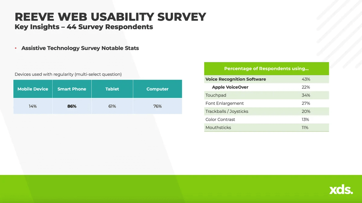
Before we moved a single pixel, we focused on understanding the people we were designing for. At XDS, we believe that great design starts with deep listening. That means getting past assumptions and uncovering real human needs, motivations, and pain points. We kicked off with a UX research phase that was both broad and intentional. Our goal: to understand the lived experiences of our core audiences and how they engaged (or struggled to engage) with the current Reeve Foundation site.
What we did:
Stakeholder Interviews We spoke with team leads across communications, research, development, programs, and leadership to understand internal goals, organizational challenges, and future vision. These conversations surfaced critical insights about content ownership, branding gaps, and unmet user needs.
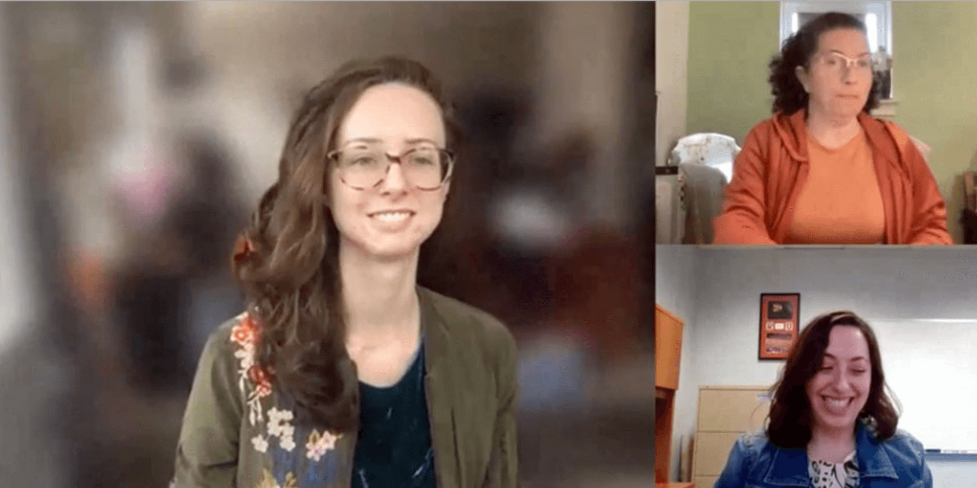
Audience Interviews We conducted video interviews with a range of community members including individuals living with paralysis, caregivers, advocates, clinicians, researchers, and donors. These conversations gave us a 360-degree view of what users needed, what they couldn’t find, and what moments mattered most.
Behavioral Personas Rather than rely on demographic personas, we created behavior-based archetypes rooted in real user attitudes, goals, and contexts. For example:
- “The Newly Injured Seeker” looking for guidance and trusted information
- “The Lifelong Advocate” focused on policy, research, and action
- “The Family Navigator” balancing care coordination and emotional support
Key Findings:
- The site felt overwhelming and difficult to navigate, especially for users with cognitive or motor impairments
- Critical resources were buried or inconsistently labeled
- People wanted to see themselves and their stories reflected — representation mattered
- Trust was earned through clarity, credibility, and compassion
Why it mattered:
This research gave us a clear mandate: simplify, clarify, and humanize the experience. It also gave us permission to challenge existing structures and reframe the site as more than an information hub as a living support system for a deeply engaged, emotionally invested community.
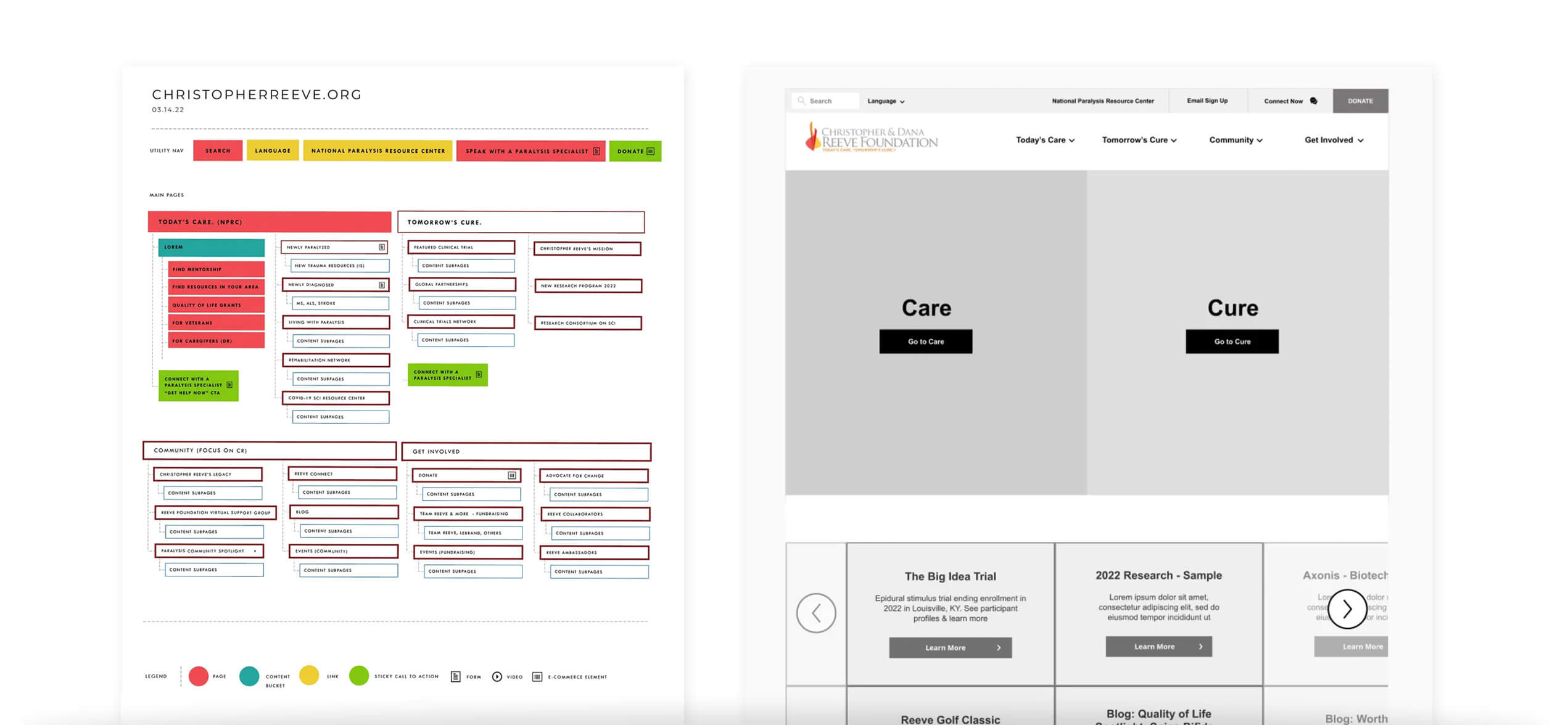
03: Mapping the Terrain
To design a system that works, you first have to understand what you’re working with. Before jumping into sitemaps or wireframes, we rolled up our sleeves and got methodical.
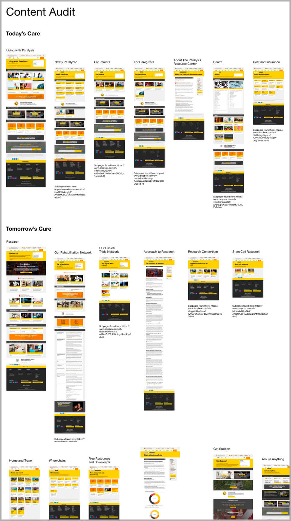
We audited every inch of the existing Reeve Foundation website. Every page, every link, every piece of content. Our goal was to create a complete inventory and assess what to keep, what to remove, and what to completely rethink.
Our process:
- Full-Site Screenshot Inventory We captured and cataloged every single page on the site. Hundreds of screens across multiple templates, program areas, and microsites. This gave us a visual map of the entire ecosystem and helped identify layout patterns, inconsistencies, and content gaps.
- Content Tagging and Categorization Each page was tagged by topic, audience, content type (such as articles, resources, CTAs, or forms), and performance priority. This allowed us to spot duplicate content, outdated materials, and opportunities for consolidation.
- Heuristic and Structural Evaluation We evaluated every section for clarity, usefulness, accessibility, and navigational logic. We assessed headline structure, page density, link behavior, and the overall user flow.
- Comparative Benchmarking We reviewed similar nonprofit and healthcare organizations to surface best practices in information architecture, labeling, and storytelling. This helped us define what could differentiate the Reeve Foundation.
What we uncovered:
- The content was valuable but fragmented. Different programs had been publishing in silos, without a shared taxonomy or structural logic.
- High-need information, especially for newly injured individuals and caregivers, was often hard to find or buried under unclear labels.
- Visual and editorial tone shifted from section to section, creating a disjointed user experience.
- Redundant content and outdated pages created confusion and reduced trust.
This audit gave us the clarity and direction we needed. It became the foundation for a smarter, more intentional content strategy. It also gave the design team the context to build a system that supported real people, not just organizational structure.
04: Structuring for Impact
The sitemap and wireframes emerged from real user tasks. We structured the site to reduce friction and improve wayfinding, but also to highlight key narratives and programs. Accessibility, SEO, and cross-device fluidity were foundational.
Artifacts:
- Sitemap and IA strategy
- Modular wireframes across core templates
- User journey flows
- Navigation prototypes and task path testing
05: Shaping the Story
With structure in place, we shifted into storytelling. This meant defining a content strategy that could unify tone, simplify complexity, and bring forward authentic voices. From headlines to CTAs to long-form content, we wrote and edited with purpose.
Deliverables:
- Voice and tone guidelines
- Page-level content outlines
- Updated taxonomy and tagging strategy
- Microcopy and call-to-action systems
06: Designing a Living System
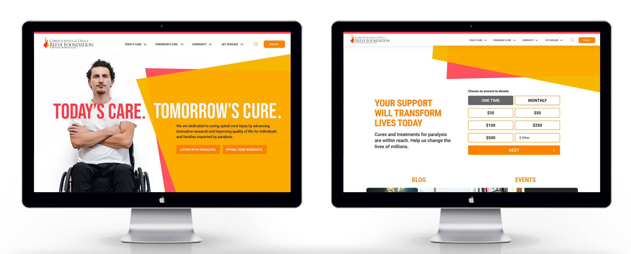
With a clear content strategy and structure in place, we turned our focus to bringing the brand to life visually. This wasn’t about just refreshing the look. It was about designing a system that could express the Reeve Foundation’s values — hope, action, resilience, and community — across every touchpoint and screen size.
We knew we weren’t designing for a single moment. We were building a living, breathing system that could grow with the organization and respond to the real needs of its audiences.
Design Explorations:
We started by creating a range of visual directions, each grounded in strategic themes uncovered during our research. These early explorations allowed us to test different tonal approaches and push the edges of the brand expression, without losing sight of clarity and accessibility.
- Option 1: Bold and Activist Focused on strong typographic hierarchy, high-contrast color, and urgent essaging. This direction leaned into the Foundation’s advocacy work and legacy of pushing boundaries.
- Option 2: Empathetic and Supportive Used softer colors, more open white space, and warm photography. This route aimed to build trust and emotional resonance with individuals navigating trauma, caregiving, or long-term conditions.
- Option 3: Modern and Modular Built around a flexible grid and component system, this version prioritized clarity, scalability, and structure. It was designed to handle a wide range of content types, user paths, and devices.
We brought these options into collaborative working sessions with the client team, walking through the rationale and use cases behind each. Rather than pick one direction wholesale, we used this feedback to evolve a hybrid system that balanced empathy with energy, structure with storytelling.


Core System Elements:
- Templates and Modules We designed a robust library of page templates and content modules, from program overviews and news feeds to donation forms and personal stories. Each was crafted to be accessible, mobile-first, and easy to scale.
- Photography and Visual Language We curated a photography style that reflected the real people behind the mission — diverse, candid, and full of dignity. Visual guidelines ensured consistency across partner content, internal teams, and campaigns.
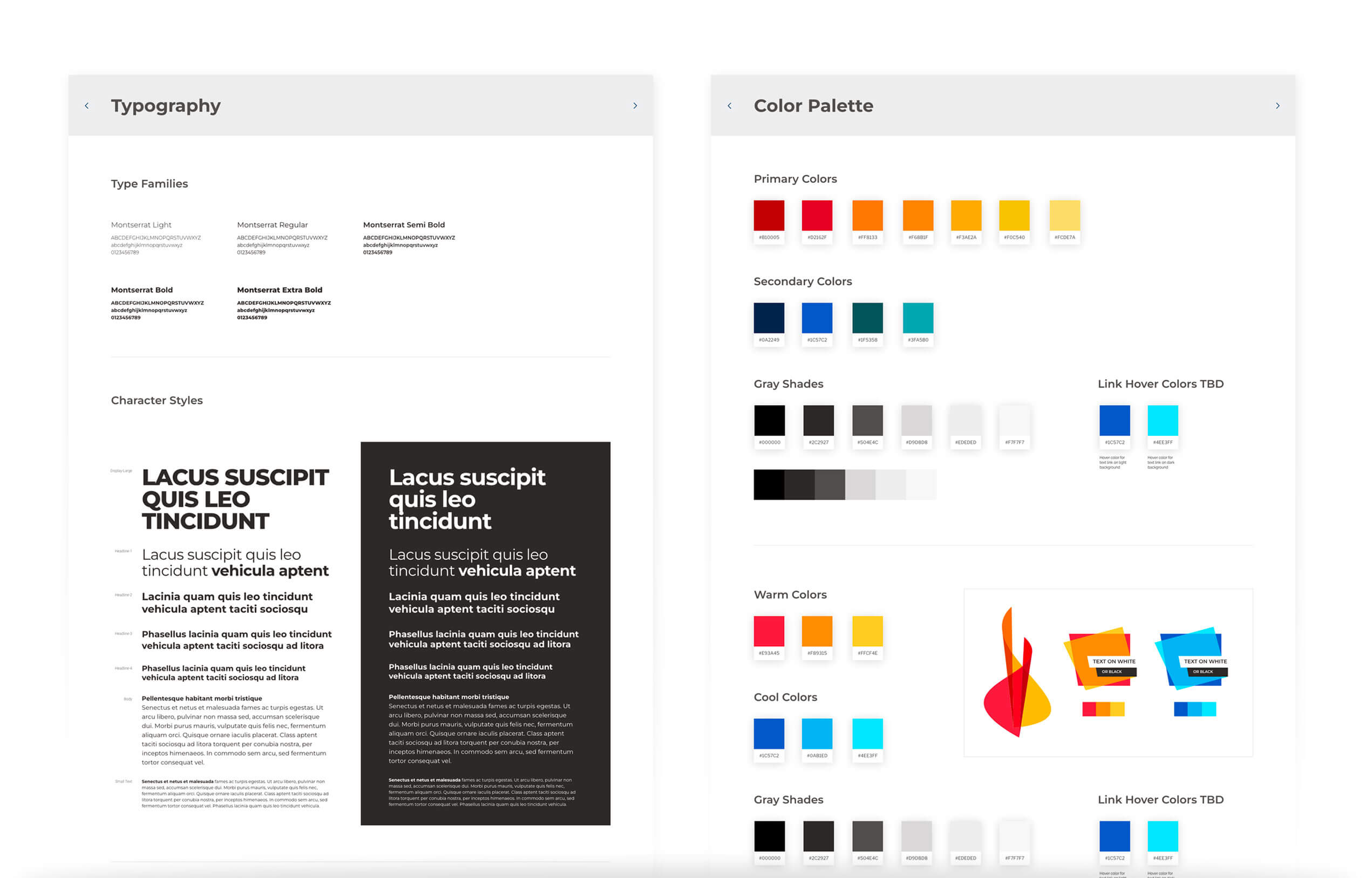
- Color and Typography We refined the brand palette to improve accessibility and legibility, while preserving the emotional cues of the original identity. Typography choices were optimized for readability and allowed for flexible expression across headlines, body content, and data.
- Motion and Interaction Micro-interactions and animations were used sparingly, with intention. Focus indicators, loading states, and hover behaviors were designed to guide without distracting.
- Design System and Style Guide Everything was captured in a comprehensive visual style guide and component library. This empowered the Foundation’s internal teams and future partners to build consistently and confidently.
This phase was about more than aesthetics. It was about honoring the weight of the mission while creating a digital space that felt empowering, uplifting, and deeply human. The final design didn’t just look better — it worked better. It helped people find what they needed faster, trust what they were reading, and feel more connected to the cause.
07: Design Handoff and System Readiness
Before anything went into code, we made sure everything was ready for scale. At XDS, we don’t just design pages — we design systems. And that means giving developers what they need to bring the experience to life accurately, efficiently, and sustainably.
Once the full visual design was complete, we shifted into what we call the production design phase. This is where we translate creative decisions into a fully documented, modular system that developers can trust and build on long after launch.
Deliverables for Development:
- Comprehensive Style Guide We created a detailed visual guide that outlined every design element — colors, typography, spacing, grid rules, iconography, form behavior, and interactive states. This guide served as the single source of truth for design consistency across all templates and future iterations.
- Component Library and UI Kits Every module from the site — whether it was a content block, CTA section, donation form, or video embed — was broken into reusable components. These were built in a design system file and mapped to developer-ready specs for seamless integration.
- Asset Kit and Documentation We delivered a complete set of optimized assets, including icons, photography rules, SVGs, alt text guidelines, and fallback strategies for accessibility. The documentation also included notes on animation behavior, mobile responsiveness, and ADA compliance.
- Dev Kickoff and Collaboration Our design and dev teams don’t work in silos. We ran handoff sessions with the development team to walk through the system, flag known edge cases, and collaborate on implementation strategy. Figma files were annotated throughout, and we stayed embedded during QA to ensure fidelity between design and build.
Looking Back, Building Forward
Leading the Reeve Foundation website redesign was a powerful reminder of why we do this work. It wasn’t just about solving usability issues or updating a visual system. It was about translating a mission into a digital experience that feels honest, accessible, and empowering. The goal was to support a community that deserves to be seen, heard, and helped at every step. From the first interview to the final handoff, we designed with intention and empathy. We built not just a website, but a flexible system the Foundation can evolve with. This project reflects the kind of work we strive for at XDS. It is grounded in insight, crafted with care, and built to create real impact.
About the Experience Design Studio
The Experience Design Studio is an award-winning digitally native customer experience agency founded in 2017 by two agency veterans, bringing their collective creative, user experience, marketing, technology, and healthcare expertise together.
XDS is a full-service digital agency providing strategy to creation, consulting, design, engineering, marketing, and analytics, with the aim of providing seamless DTC and B2B experiences across all digital touch points, with common sense sprinkled in.