
Last Updated: 7/15/2026
TL;DR · Which ISI display pattern should you use?
- Bottom ISI tray is the default for most pharma sites. It preserves above-the-fold real estate for campaign messaging and keeps ISI legally prominent.
- Right rail ISI looks fresh but breaks scroll behavior. Only use it when the marketing narrative genuinely requires it and legal signs off.
- Horizontal anchor bar is the least-invasive option when ISI content lives natively on the page.
- Mobile ISI must meet a 44x44 pixel tap target minimum and should collapse gracefully without stacking pop-ups.
- Fair balance is decided by MLR, not marketing. Get UX proposals in front of legal before pixels move.
What is Important Safety Information?
The three ISI display patterns compared
Designing mobile ISI that stays compliant
Three UX rules that keep ISI readable
Working with legal and MLR on ISI UX
Frequently asked questions
What is Important Safety Information (ISI)?
Important Safety Information (ISI) is the FDA-mandated risk-communication content that appears alongside any promotional claim in pharmaceutical or medical device advertising. On a website, ISI has to be presented with prominence comparable to the benefit message, not tucked behind an accordion, shrunk into a footer, or delayed by a modal. This is the practical translation of the fair balance standard in FDA advertising regulations.
ISI is not the same as Prescribing Information (PI). PI is the full label. ISI is the summary of the most important risks that a viewer of the promotional content needs to see in-context with the benefit claim. On pharma websites, ISI is the persistent tray, right rail, or anchor bar that stays with the user as they consume the marketing content. Read our full guide on fair balance in pharma advertising for the legal foundation this sits on.
The FDA gives brands latitude on how ISI is displayed. The requirement is that its prominence be reasonably similar to the promotional content. Per FDA: "The law requires that product claim ads give a 'fair balance' of information about drug risks as compared with information about drug benefits."
The three ISI display patterns compared
Across hundreds of pharma and medical device sites, ISI implementations cluster into three primary patterns: the bottom tray, the right rail, and the horizontal anchor bar. Each has real trade-offs.
| Pattern | Screen real estate for marketing | Mobile behavior | Legal risk profile | Conversion impact |
|---|---|---|---|---|
| Bottom tray | Highest. Leaves full-width space for campaign messaging above. | Collapses cleanly to a persistent bar. Tap-to-expand. | Low. Well-understood by MLR and industry standard. | Best. Preserves hero, navigation, and CTA visibility. |
| Right rail ISI | Medium. Sacrifices roughly 30% of horizontal space. | Poor. Right rails typically stack under content on mobile, defeating the purpose. | Low to medium. Prominence is easy to demonstrate to legal. | Mixed. Scroll conflicts between page and side tray create measurable frustration. |
| Horizontal anchor bar | Highest. A thin persistent bar with an anchor link to native page ISI. | Excellent. Small persistent footer works cleanly on mobile. | Medium. Requires ISI content to be native to the page below the fold; MLR must approve the anchor pattern. | Strong. Least-invasive of the three. |
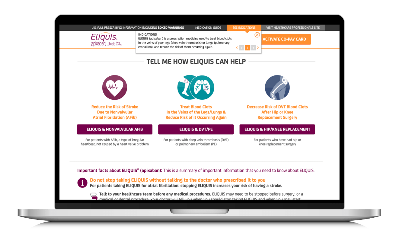
1. Bottom ISI tray (the industry default)

Most pharma companies implement the bottom ISI tray with the same standard: a 33% viewport-height tray on desktop and mobile, with a 50/50 split between Important Safety Information and Indication content. Keytruda is a canonical example. This pattern is the safest choice with legal because prominence is easy to demonstrate and it is the industry expectation.
An equally common variant integrates Indication content inline with ISI content or removes the Indication section from the tray entirely. Which version is allowed depends on the MLR or Promotional Review Committee decision for that specific brand. Humira is one example of the compressed tray variant.
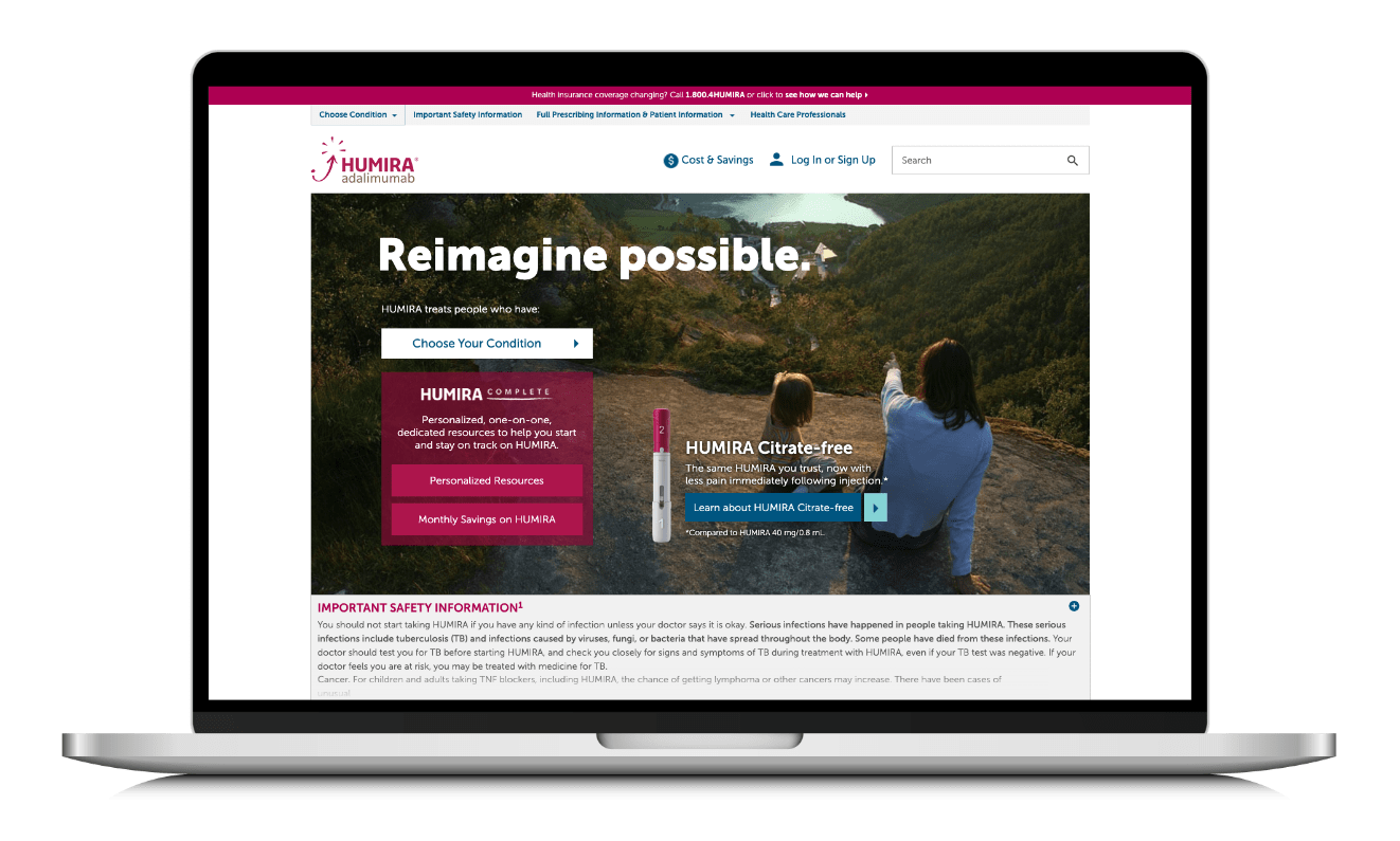
When the brand carries a Boxed Warning, that warning has to appear with heightened prominence inside or above the ISI tray. Boxed Warning treatment is not optional and requires design attention independent of the tray pattern chosen.
2. Right rail ISI (fresh look, real usability tax)
The right rail Indication and ISI pattern surfaces on brands like Ibrance. It looks distinctive next to the bottom-tray-dominated peer set. It also introduces two usability problems that show up consistently in user testing.

The first problem is scroll conflict. When users try to scroll the main page, browsers often hijack their input to scroll the right-rail tray instead. That mismatch produces measurable frustration and higher exit rates. The second is mobile behavior. Right rails typically collapse below the main content on smaller viewports, which means the pattern's promise of persistent visibility disappears on the majority of traffic.

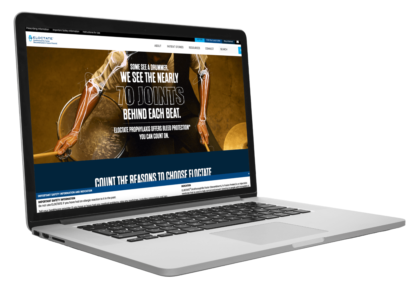
3. Horizontal anchor bar (the least-invasive option)
The horizontal anchor bar is a thin persistent strip at the bottom of the viewport that links to the ISI content living natively in the page body. Eloctate is a good example. When a user taps or clicks the bar, the page auto-scrolls to the ISI section. This pattern works well when MLR permits ISI to be treated as native page content instead of a persistent overlay, and when the ISI content itself is high enough on the page to remain visible on scroll.

A related variant treats ISI language as native inline content on the page and pairs it with a separate Indication drop-down. Eliquis uses this approach. The trade-off is that the persistent overlay disappears once the user scrolls past the ISI section, so this only works if the ISI section itself is impossible to miss.
How to design a mobile ISI experience that stays compliant
Most pharma brand traffic now comes from mobile devices, and mobile is where ISI design fails most often. The available real estate is smaller, cognitive load is higher, and users are less patient with any pattern that hides or interrupts primary content. For a deeper mobile-specific playbook, see the mobile ISI design and pharma compliance guide.
Sticky vs. anchor vs. modal on mobile
Sticky bottom trays are the mobile equivalent of desktop bottom trays. They work. Anchor bars work when the ISI content lives above the fold or high on the page. Modals do not work. A modal that forces users to acknowledge ISI on page load creates cognitive overload, delays content access, and is measurably associated with higher bounce rates in mobile pharma UX testing.
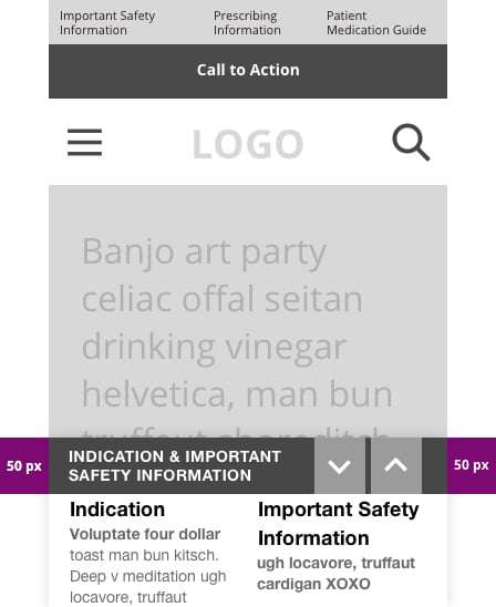
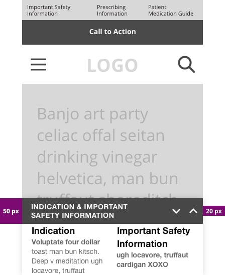
Font size, contrast, and tap targets
The W3C Web Accessibility Initiative sets a minimum tap target size of 44x44 pixels for mobile under WCAG 2.1. ISI expand and collapse controls have to meet this bar. Under-sized arrows on ISI trays lead to users tapping the wrong control or missing the tray entirely.
Mobile ISI examples worth studying
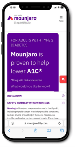
Mounjaro uses a tabbed mobile treatment that separates Indication and ISI content while keeping them adjacent. The tabs preserve contextual relevance without forcing users to scroll through both at once.
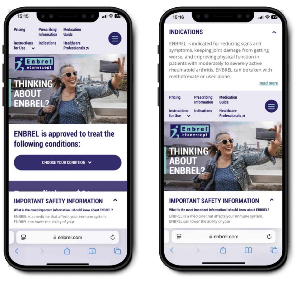
Enbrel carries the desktop pattern over to mobile without breaking. A top-linked Indication summary gives users a preview, and users can opt in to read the full text box. That pattern respects mobile attention spans without hiding required content.
Preventing user-hostile scroll traps on mobile
The most common mobile ISI failure is a tray that captures scroll input meant for the page. Test every ISI implementation on real devices, not just browser resizing. If a user cannot naturally scroll the page while an ISI tray is visible, the design has failed no matter how legally compliant it looks in review.
Three UX rules that keep ISI compliant and readable
Rule 1: Give up above-the-fold real estate to campaign messaging, not to ISI
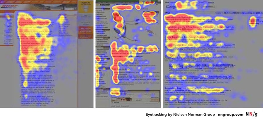
Marketers typically want campaign artwork and clear navigation in the above-the-fold priority area. Users eye-track content in an F-shaped pattern, so the top-left region gets the most attention. If MLR allows it, use a bottom tray so campaign messaging owns that first view.
Rule 2: Only collapse ISI when legal permits it, and only with large tap targets
Where legal allows a collapsible tray, size the collapse and expand controls to at least 44x44 pixels. Data from mobile pharma sites shows roughly 2x the number of tray-collapse actions on mobile versus desktop. Small tap targets translate directly into misfires and frustration.
Rule 3: No stacking pop-ups on page load
Pharma sites accumulate interruptive UI: HCP entry interstitials, cookie banners, region gates, ISI trays. Every stacked overlay adds extraneous cognitive load. The more mental resources a user has to spend to reach the actual content, the higher the exit rate. Sequence overlays, do not stack them, and eliminate any that do not add value. See our full write-up on the hidden cost of compliant healthcare websites.
How to work with legal and MLR on ISI UX changes
ISI layout is a design decision that legal owns. Fighting that is a waste of hours. The productive path is to bring MLR options with evidence, not opinions.
- Bring quantitative data. Set up event tracking on the current ISI implementation through Google Tag Manager, GA4, or Adobe Analytics. Measure tray expansions, ISI scroll depth, average time in ISI, and drop-off after ISI interaction. Bring numbers to the MLR conversation. See our HIPAA-compliant GA4 setup guide for the tracking foundation.
- Bring qualitative research. Run 5 to 8 unmoderated user tests on the current layout and each proposed alternative. Video captures of scroll-conflict frustration are more persuasive than any deck.
- A/B test legally approved options. When MLR gives you two compliant variants, run a real experiment. Optimize inside the constraint set instead of arguing about the constraint set.
- Read the FDA guidance directly. The FDA Draft Guidance on Presenting Risk Information and the FDA Draft Guidance on Internet and Social Media Platforms with Character Space Limitations are the primary references. Cite them in MLR conversations.
For the current regulatory context around all of this, see our companion posts on the OPDP submission process and FDA social media guidelines for pharma in 2026.
Frequently asked questions about ISI design
What is the difference between ISI and Prescribing Information?
Important Safety Information (ISI) is the summary of the most important risks associated with a product, presented alongside promotional content. Prescribing Information (PI) is the full FDA-approved product label. ISI is what accompanies the marketing message in-context. PI is the complete reference document, usually linked from the ISI section and downloaded as a PDF.
Does the FDA require ISI to be immediately visible on a webpage?
The FDA requires that risk information be presented with prominence comparable to benefit claims. It does not mandate a specific display pattern such as a bottom tray or a modal. What matters is that the average viewer of the page walks away with a balanced impression of benefits and risks, not that the ISI is force-displayed on load.
Can ISI be collapsed on mobile?
ISI can be collapsed on mobile if the brand's MLR approves the pattern and the collapse control meets accessibility standards (44x44 pixel tap target minimum under WCAG 2.1). Some MLR teams require ISI to be expanded by default on mobile. Others permit collapsed-by-default with a persistent visible bar. The decision depends on the brand's risk profile and any Boxed Warning requirements.
Is a bottom tray ISI still compliant in 2026?
Yes. The bottom ISI tray remains the industry-standard pattern and continues to satisfy FDA fair balance expectations when implemented with adequate real estate and readability. The 2024 and 2025 regulatory tightening focused on TV, social, and creator content, not on the website tray pattern itself.
What are the three most common ISI compliance mistakes?
The three most common ISI mistakes are: (1) undersized tap targets on mobile that violate WCAG 2.1 and frustrate users, (2) stacking multiple pop-ups on page load so users cannot reach the marketing content without dismissing several overlays, and (3) using a right rail ISI without solving the scroll-conflict problem, which reduces both usability and effective ISI prominence.
How does ISI interact with the FDA 2024 direct-to-consumer rule?
The FDA final rule on DTC prescription drug advertisements published in 2023 and enforced from 2024 focused primarily on TV and radio advertisements, requiring clear, conspicuous, and neutral presentation of major statement risks. It did not directly change website ISI display requirements, but it raised the enforcement baseline for what counts as "adequate provision" of risk information across channels. Website ISI decisions should assume that MLR will apply the tightened DTC standard when reviewing digital properties.
Where should ISI appear on a pharma landing page?
On a pharma landing page, ISI should appear in one of three positions: as a persistent bottom tray, as a native section high on the page paired with an anchor bar, or (less commonly) as an inline section paired with a right rail. The specific position depends on legal review, but the principle is that a user should encounter meaningful ISI within the natural reading path of the page, not only after scrolling past the primary CTA.
XDS: Where compliance meets conversion
At XDS, we work with global brands across healthcare and life sciences to build experiences that perform on the metrics that matter: speed, accessibility, usability, compliance, and conversion. We know how to work inside AEM and Sitecore constraints while delivering modern digital experiences. Strategy, UX, development, and analytics ship together, not in sequence.
Want to know how your ISI implementation measures up? Request a free audit and we will share a UX plus digital performance scorecard.
For related reading, see our guides to mobile ISI design compliance, fair balance in pharma advertising, AI-generated pharma content FDA compliance, UX design in healthcare marketing, and how to choose a healthcare marketing agency.